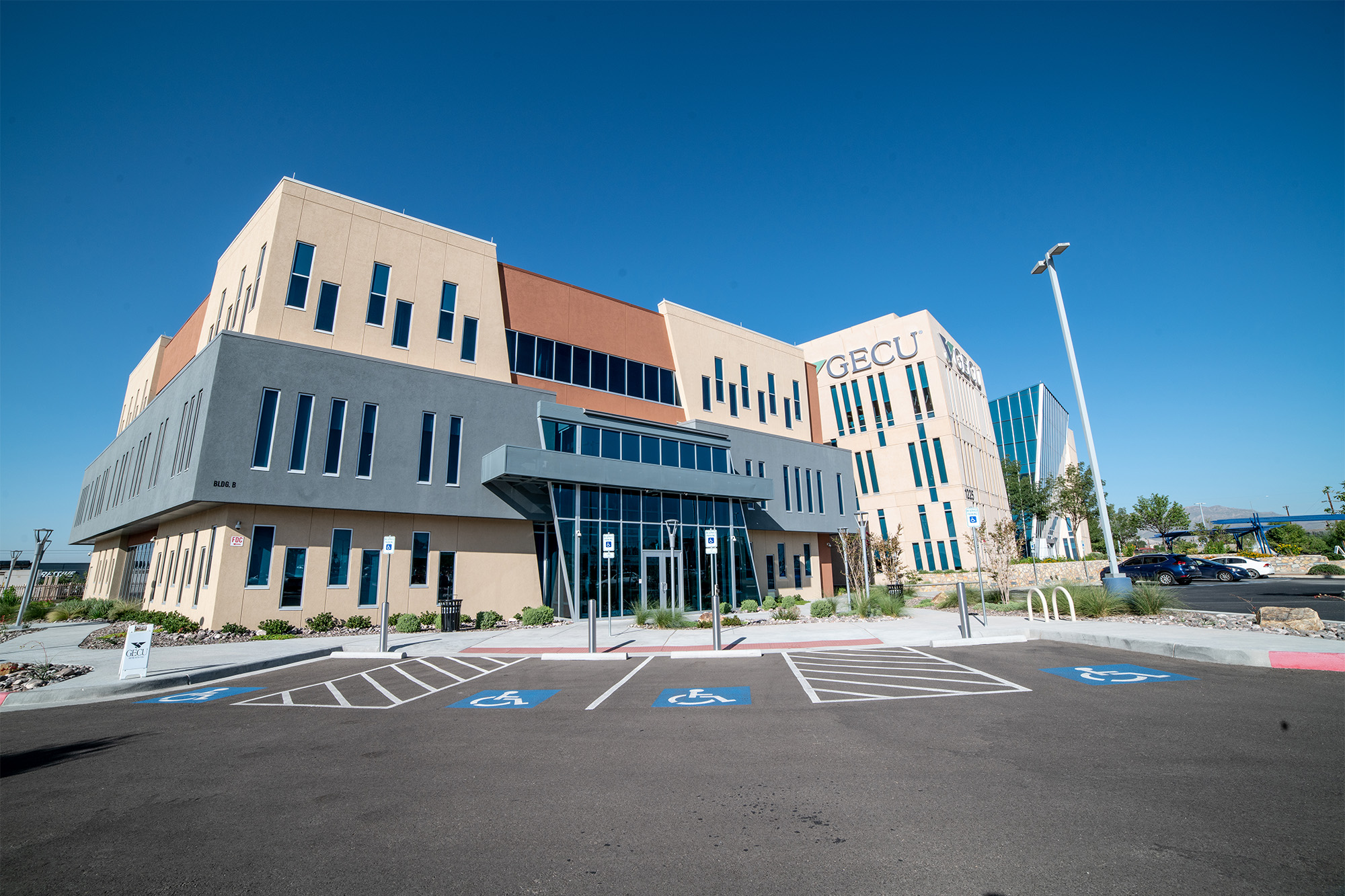
- HQ & Flagship Transformation -
Together Credit Union

A Corporate Space With Both Staff & Client In Mind
Like many growing credit unions, Together CU faced the dilemma of a headquarters that was too small, outdated, and not aligned with its brand’s core values. The staff was split between two locations over 15 miles apart, and both were bursting at the seams. Departments were spread all over the place, people were working in basements and other non-ideal areas due to overflow, parking was sparse, and the overall environment was simply drab. And if that wasn’t bad enough, having two divided locations rather than one united headquarters was starting to damage their company culture.
Together CU knew it was time for a change, but with a project this big, they wanted to make sure they were making smart decisions to ensure long-term success. To add even more pressure, they were also interested in building a flagship branch at this campus to test new transformation concepts for their entire branch network.
Together CU set out to find the perfect partner, and after reviewing several vendors, they selected DBSI.
DBSI wanted to help Together CU make the best decision to ensure cohesion and sustained room for growth, so they conducted an extensive feasibility study that explored several options and budgets, including:
1. Restack existing HQ, but with limited room for future growth
2. Move their headquarters into a new but existing building
3. Build a new facility on a new site
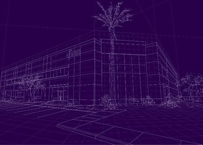
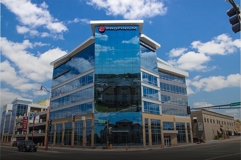
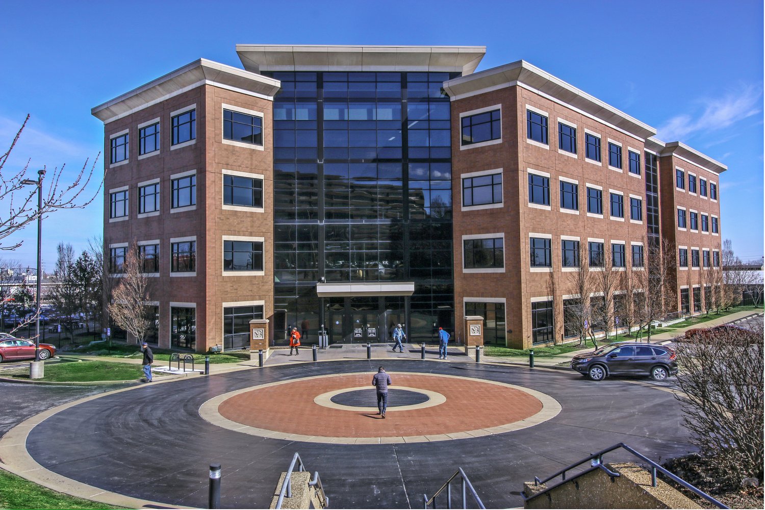
Together CU decided to purchase and remodel a 128,000 sqft, 4-story building only a half-mile away from their existing campus. This option was cost-effective and could give them all the amenities, department collaboration, productivity, and experience they desired.
Through DBSI’s FAQtor7 HQ analysis tool, a future-proof design was developed and executed. No guesses, but rather data-based decisions at every turn. The final modern building included a beautiful view of the St. Louis skyline and many features to enhance the work environment, including an on-site café, open floorplan, gated parking, and natural daylight for every floor.
The most impressive part? DBSI’s Strategic Relocation Services handled all the communication and details of the move, so everyone understood the timelines, the why behind the move, how it would be executed, and more. This careful preparation allowed the move to happen over one weekend.
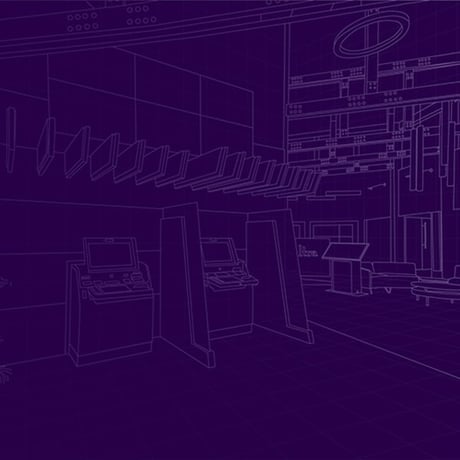
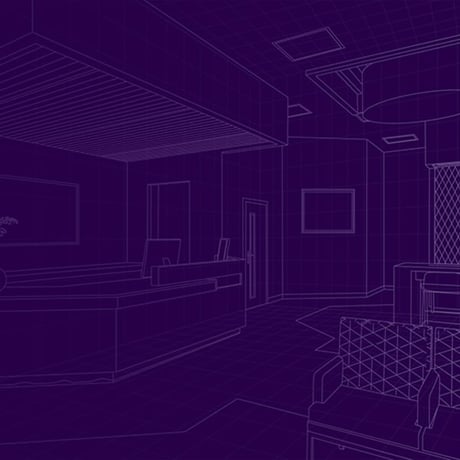
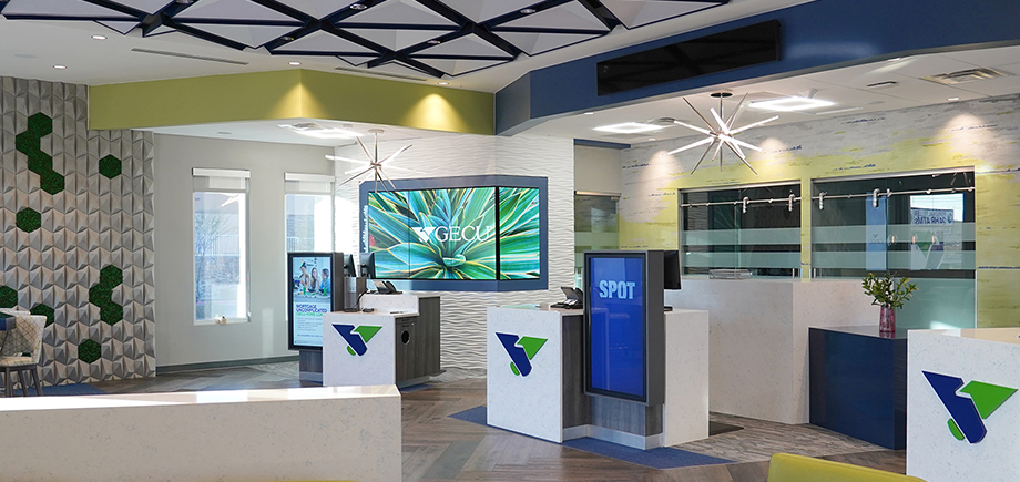
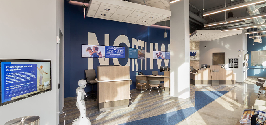
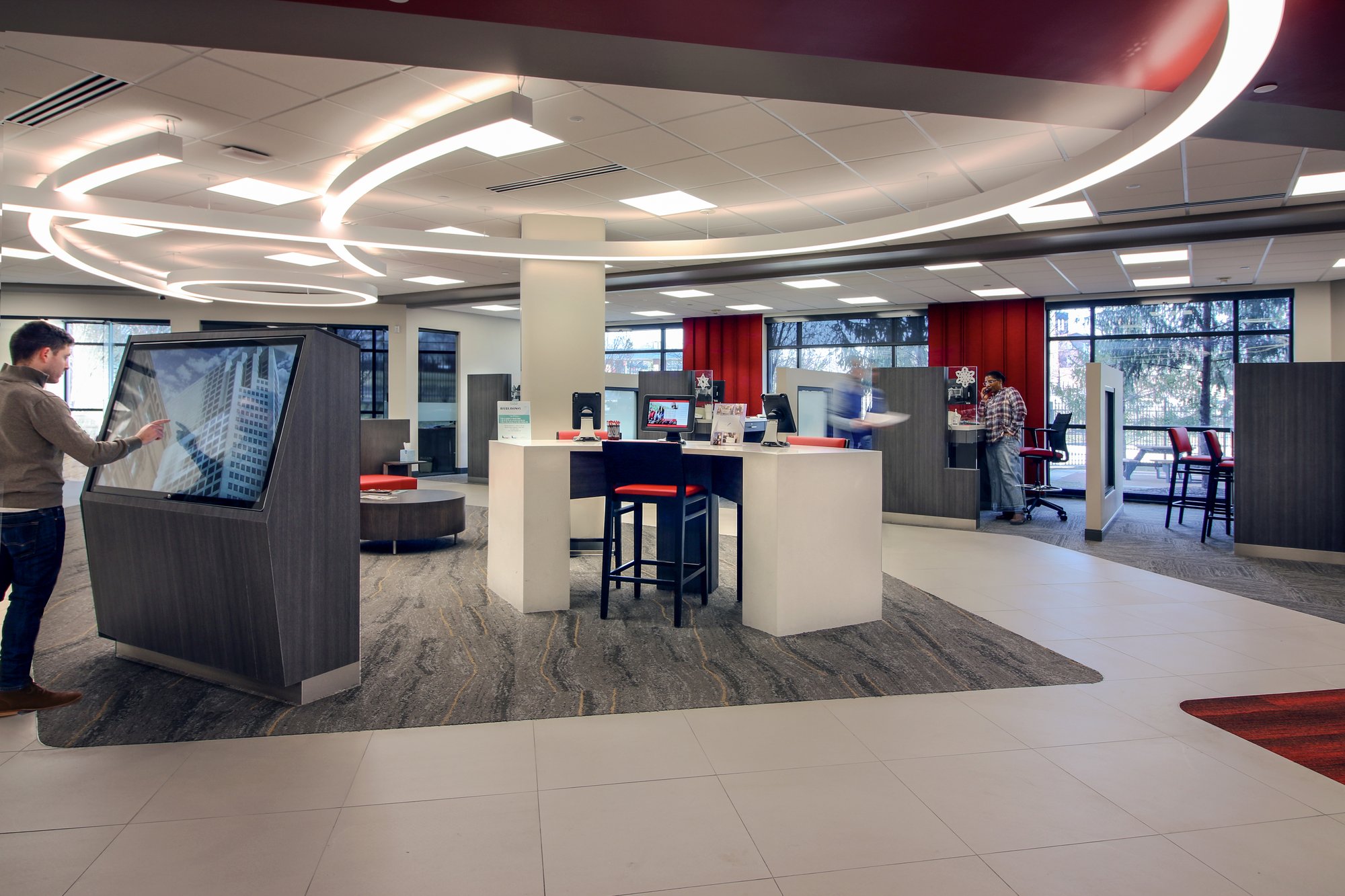
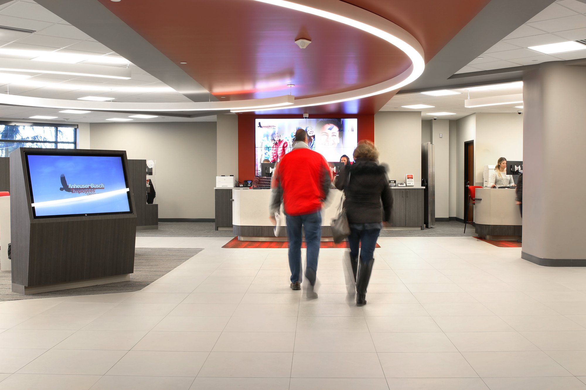
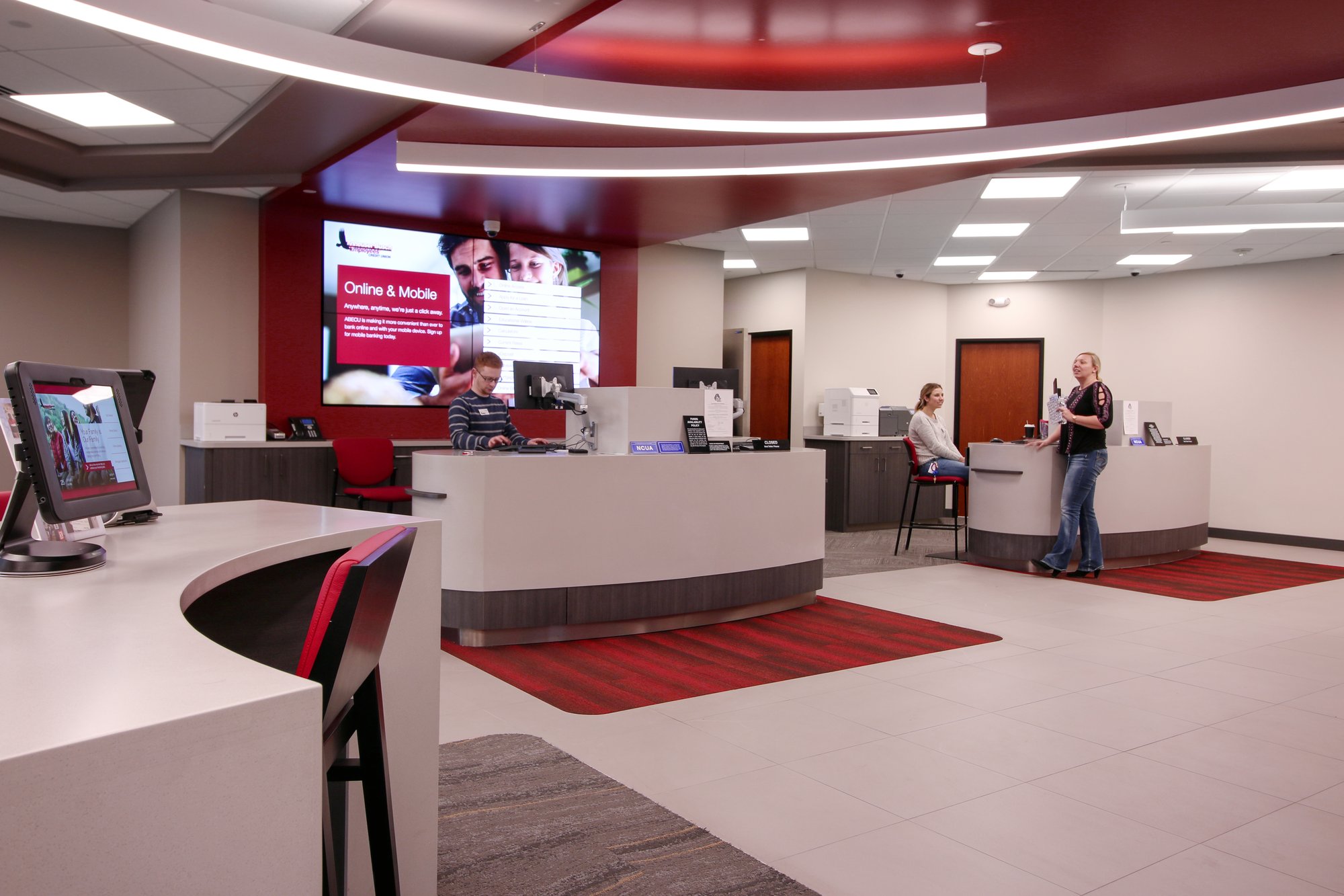
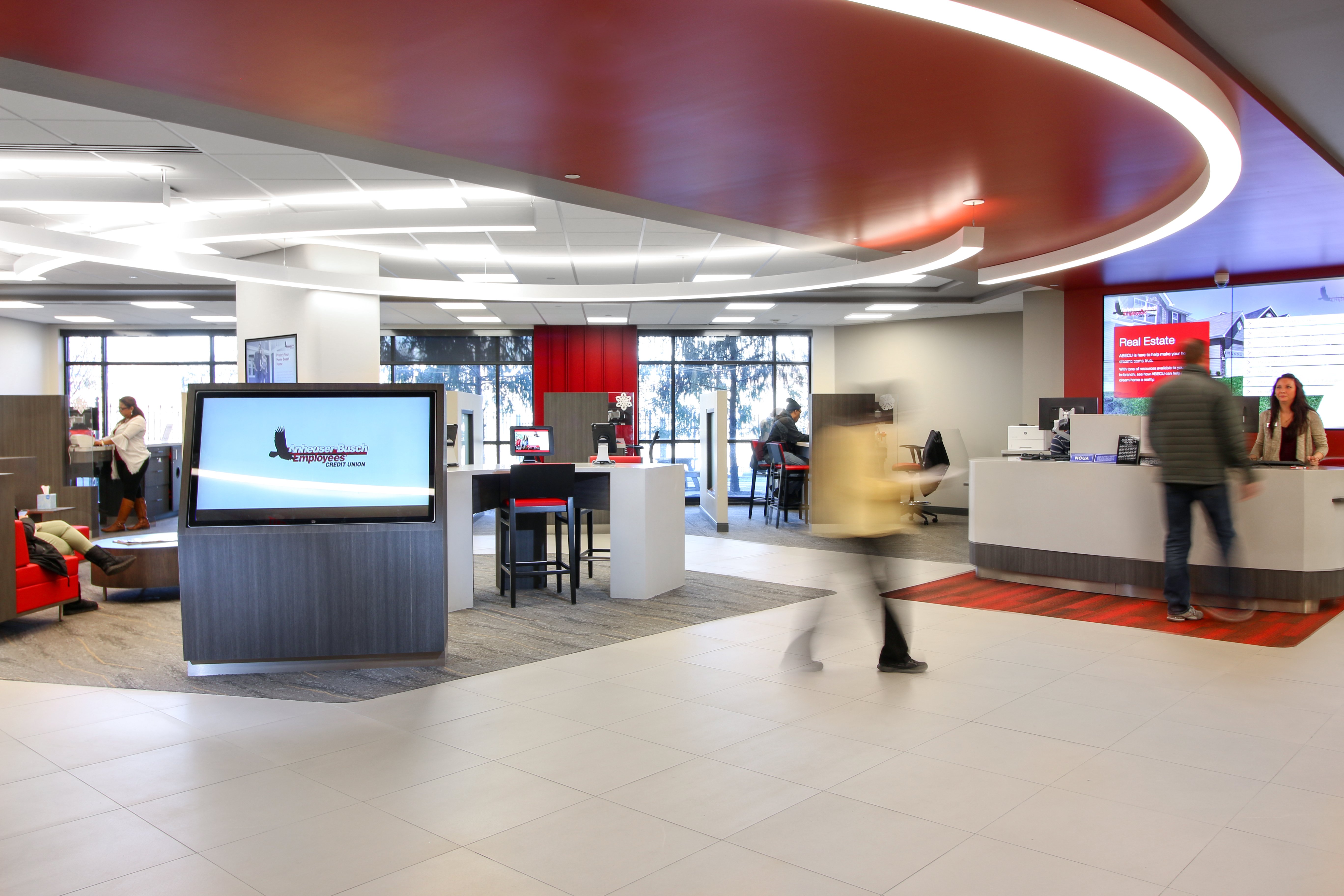
While the work on the HQ was being done, DBSI was also working on a flagship branch on the first floor. This branch embodied their new HQ environment, offering members a modern environment to complete their banking needs. This branch also came complete with retail design elements, digital signage, self-service solutions, TCRs, and more.
Design Elements
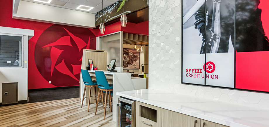
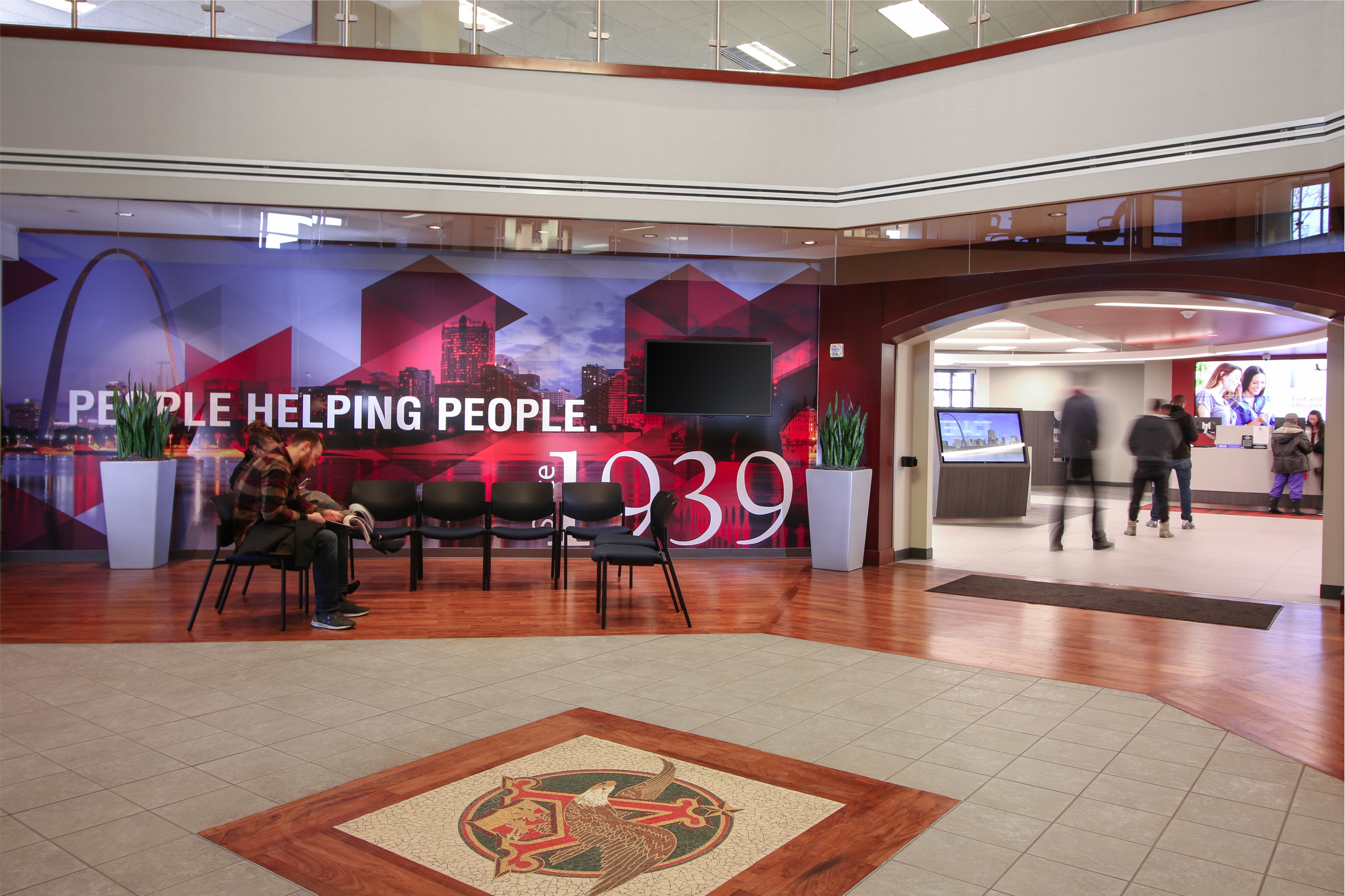
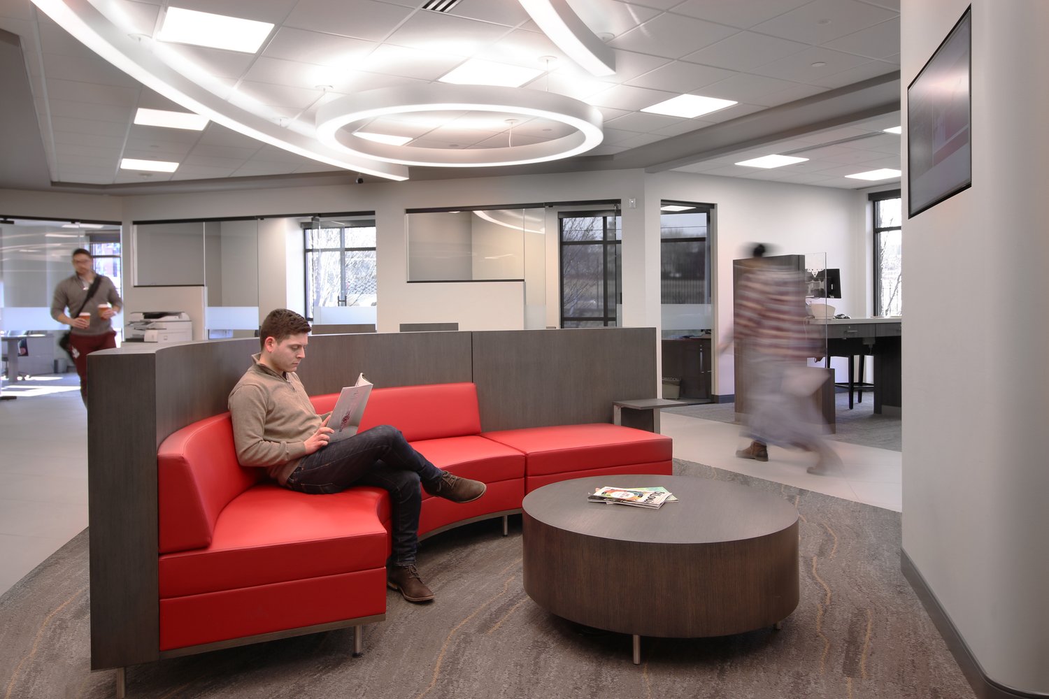
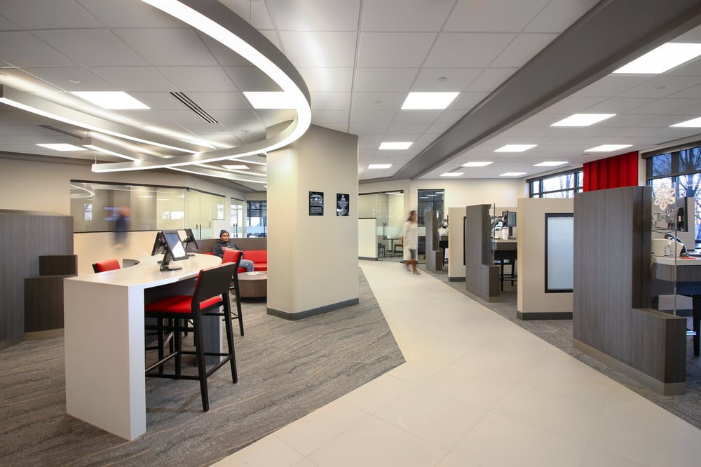
In this large corporate space, there is a cohesive and modern design that carries all the way from the first-floor flagship branch to the headquarters space above. Branded colors and an open floor plan really make the space unique.

DIGITAL SIGNAGE
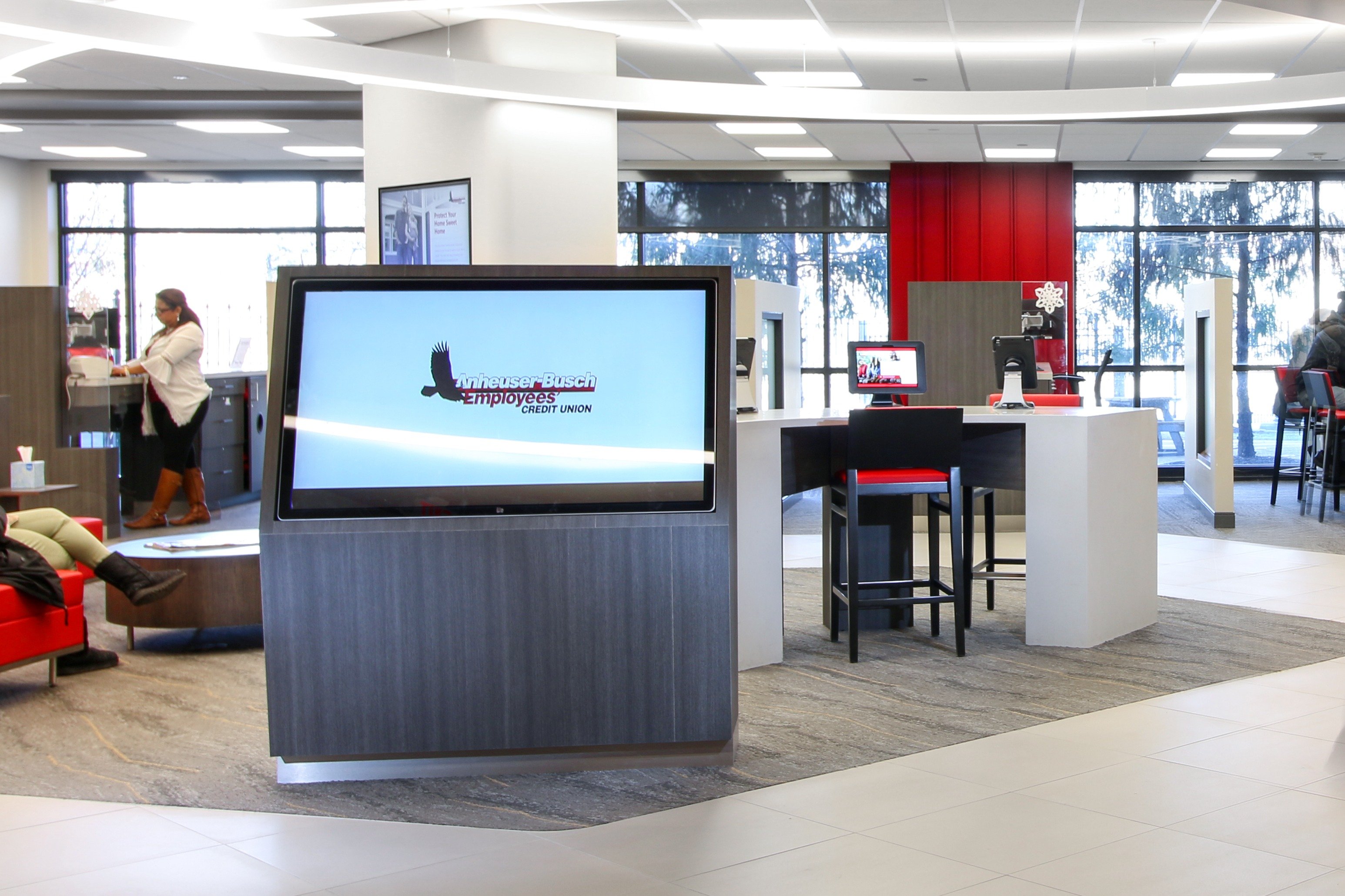
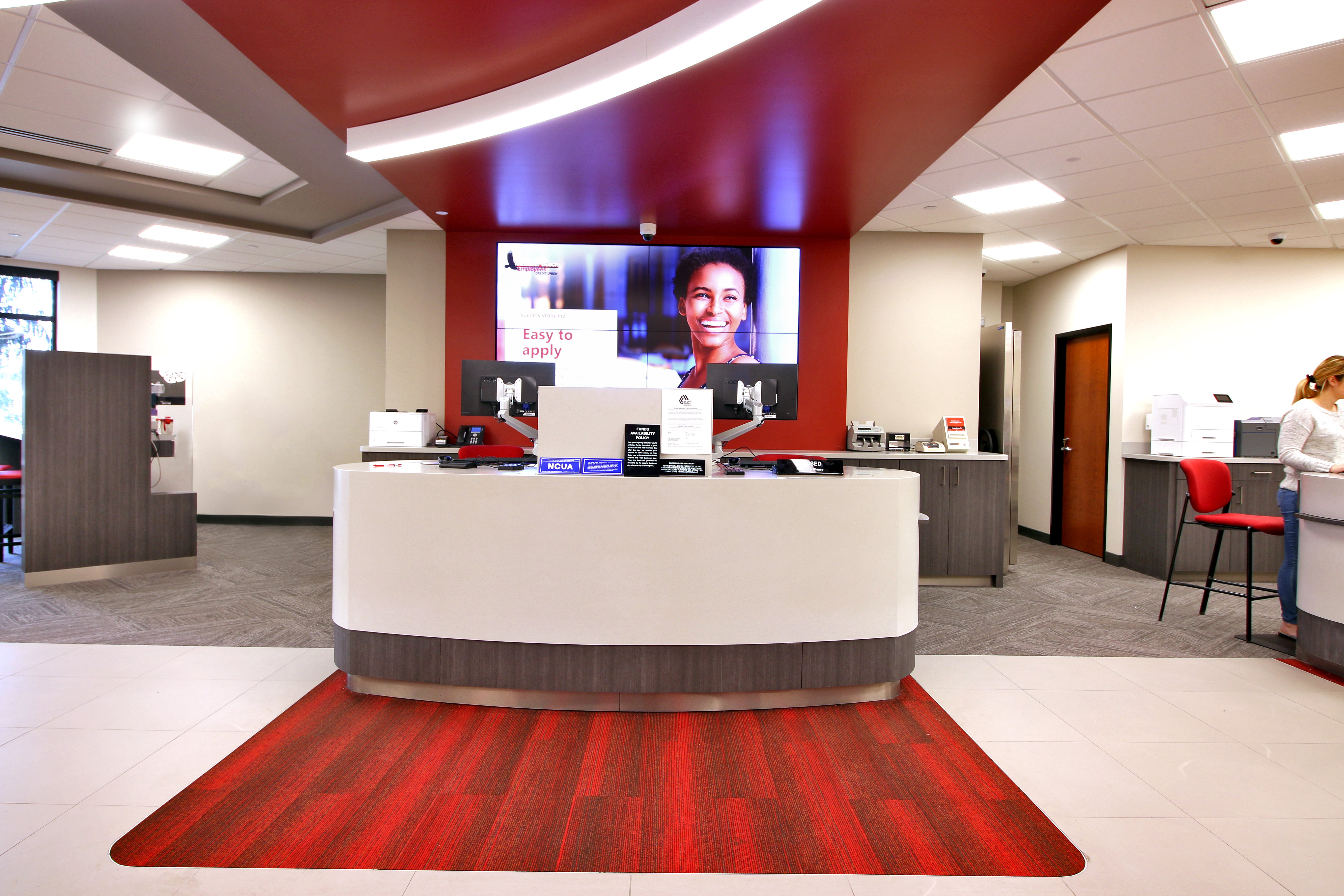
To bring their branding to life, as well as better communicate with members and staff, Together CU and DBSI created and implemented a digital signage program that is interactive, fun, and engaging. With large WOW wall displays to small, portable tablets, the signage in this space is very intentional.
"I have been involved in 3 corporate relocations in my career, and this by far was the smoothest."
Bob McKay
Together CU
Explore Similar Projects
Trust DBSI With Your Next Project
If you have a transformation project on your to-do list, let's talk about how DBSI can help make it happen.

