Skip to the main content.


Featured Projects

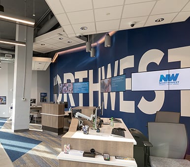
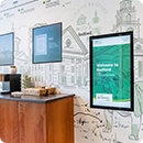
Synovus Place |
Ledyard Bank |

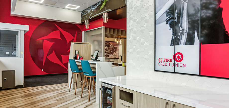
SF Fire CU |
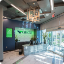
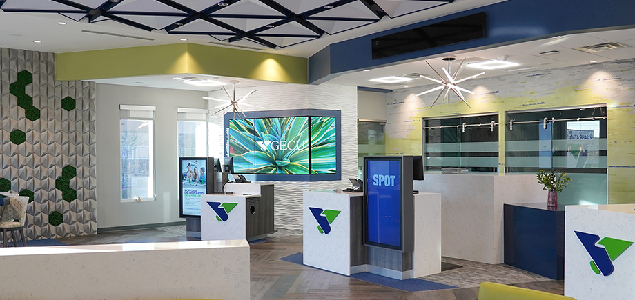
GECU |
Banking Blog
Everything transformation lives here. From designing and building a new space to adding digital signage to adopting Universal Associates, you’ll find tips and tricks for it all.
Healthcare Blog
An elevated healthcare environment starts with an educated leadership team. This blog gives all the insights, from design-build to experiential marketing solutions.
Resource Library

Reports |
Guides |

Webinars |

Videos |

Infographics |
Case Studies |
EBOOKS |

Sign Up For Our Newsletter
We are always looking to add talented, forward-thinking innovators to our team. If that sounds like you, you should apply for a role with us.